When James approached me with the idea to design a typeface, I was surprised and very hesitant to say yes. It’s true I practice lettering and calligraphy, and had a keen interest in learning type design (maybe in the far-distant future), but I never would have thought of myself a type designer, because the one thing I did actually know about type design is that it takes an incredible amount of time, effort and skill to accomplish such a feat. But James had a vision, and he believed in my ability to execute it.
Having moved his brainstorming and design thinking sessions online earlier in the year, and having worked for years within both the type design and graphic recording communities, James saw a need for a digital representation of the big, bold headlines graphic recorders would normally write on butcher paper. Anyone who has worked with James knows his enthusiasm is infectious and hard to resist — and that’s how I ended up following his lead into one of the most interesting and challenging projects that I’ve done so far in my career.
Let’s get one thing out of the way — this story is not primarily about how to design a typeface, although that does happen. It’s about my experience of tackling a project I was terrified to take on, equipped only with curiosity and an intense desire to learn. More importantly, it’s about what I picked up along the way in terms of learning about my responsibility as a designer who puts things out into the world.
Learning by doing: applying the principles of modern product design to my first typeface project
It would be hard to argue with the idea that the most logical way to start this project would be to study type design. But James asked me to approach it a different way — make a typeface and learn type design along the way. Essentially, we would take the same approach that Tangible brings to product design; we were going to make something, and learn from the experience, and then make it better. So I set out to learn how to design a font by designing a font. However, I could never have done this without some context or starting point, so I enrolled in Type Design School with instructor Lynne Yun, and Letter & Co Display Type Design Course with Martina Flor, both of which I can’t recommend highly enough. These online courses gave me the general outline of how to go about this process in the right way.
When I was ready to roll up my sleeves, we all came together around the idea to design a display typeface based off of writing with the large, broad-edged markers that graphic recorders use to write big chunky headlines on large pieces of butcher paper. James suggested I work with Neuland Markers — the marker of choice for many graphic recorders.
I had never heard of Neuland Markers before, but I ordered a handful of the “BigOne” style markers and waited anxiously for their arrival so that I could start practicing with them.
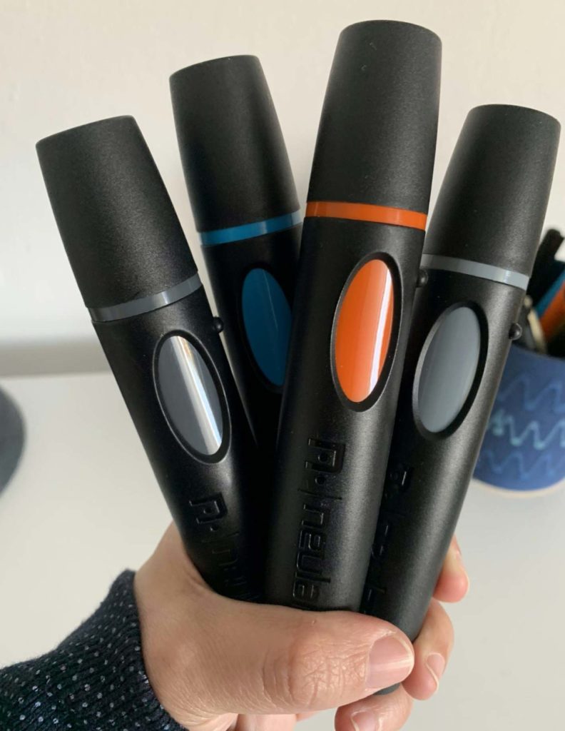
Now I was tasked with learning how to write with the Neuland Markers in the way graphic recorders do it. I did some research on the Neuland Marker website.* They feature Heather Martinez, whom they call a “Neuland Ambassador.” She teaches the Neuland Hand writing style for visual practitioners through her website letslettertogether.com. Between her resources and some excellent YouTube videos, I got started practicing writing with my Neuland Markers.
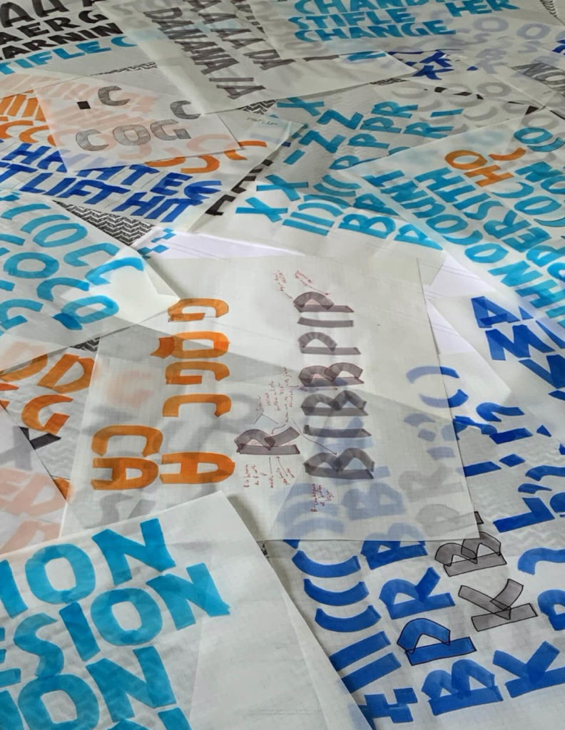
First starting with warm ups, then practicing individual letters, and then words, I got a lot of practice in. I then started putting tracing paper over my letters and used pencil to start sketching out what my initial letters for the typeface would look like. This process went on for a while, since it was my first type design experience. The more I learned, the more I realized that I needed to start over again to get something right. It’s one thing to write with a marker and get varied results, it’s another thing to design a typeface that works like a system of components, but that looks like the writing of a marker with all of its nuances. I went back to the drawing board (literally) several times during this phase.
After pages and pages of sketching, and writing and tracing and sketching some more, I thought I would take a break and do some Googling and see if someone had already had the idea to design a typeface based off of the Neuland marker. I probably should have done that first, but this is a true story so I have to tell it how it actually went down. Lo and behold – there was a very famous typeface called “Neuland.” Neuland looked similar to the “Neuland Hand” that I was learning to draw with the markers – but the Neuland typeface was designed in the 1920s by Rudolf Koch. So what came first? The Neuland typeface or Neuland Hand? This question ultimately made this project more than just about learning type design, but about acknowledging my responsibility to understand history in the context of things that we create today.
History lessons: what we as designers owe the past — and the future
The short answer is that the typeface came first. But this notion rattled the idea of what I thought I knew about typography. I had the understanding that a typeface design was influenced by a writing style or calligraphic model, not the other way around. But in this instance it was clearly opposite. Rudolf Koch designed a typeface that later influenced calligraphers to write in a similar style, with broad-edged writing instruments. So I realized I was attempting to design a typeface influenced by a writing style that was originally influenced by a typeface. Was this even allowed? I honestly had no idea. But since I’m currently living in Germany, I decided to take a road trip out to the Gutenberg Museum in Mainz and the Klingspor Museum in Offenbach to find out more. The Gutenberg Museum is one of the oldest printing museums in the world, named after Johannes Gutenberg, the inventor of printing from movable metal type in Western Europe (metal type and metal moveable type were actually invented in Korea at least 70 years before Gutenberg). They have Neuland type (in metal) in their collection. The Klingspor Museum is even more relevant as it holds the original collection of the Klingspor Type Foundry, where Rudolf Koch designed the Neuland typeface in the first place.
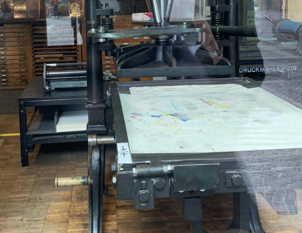
My first stop was to the Gutenberg Museum workshop, where I had my first look at real metal type. A master printer and caretaker of the collection gave me a private tour around the workshop, and knowing my interest, she showed me how to manually typeset my name using the actual Neuland metal type.
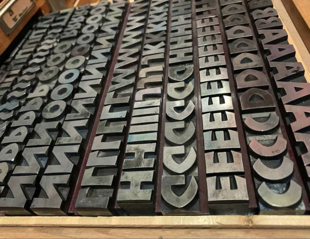
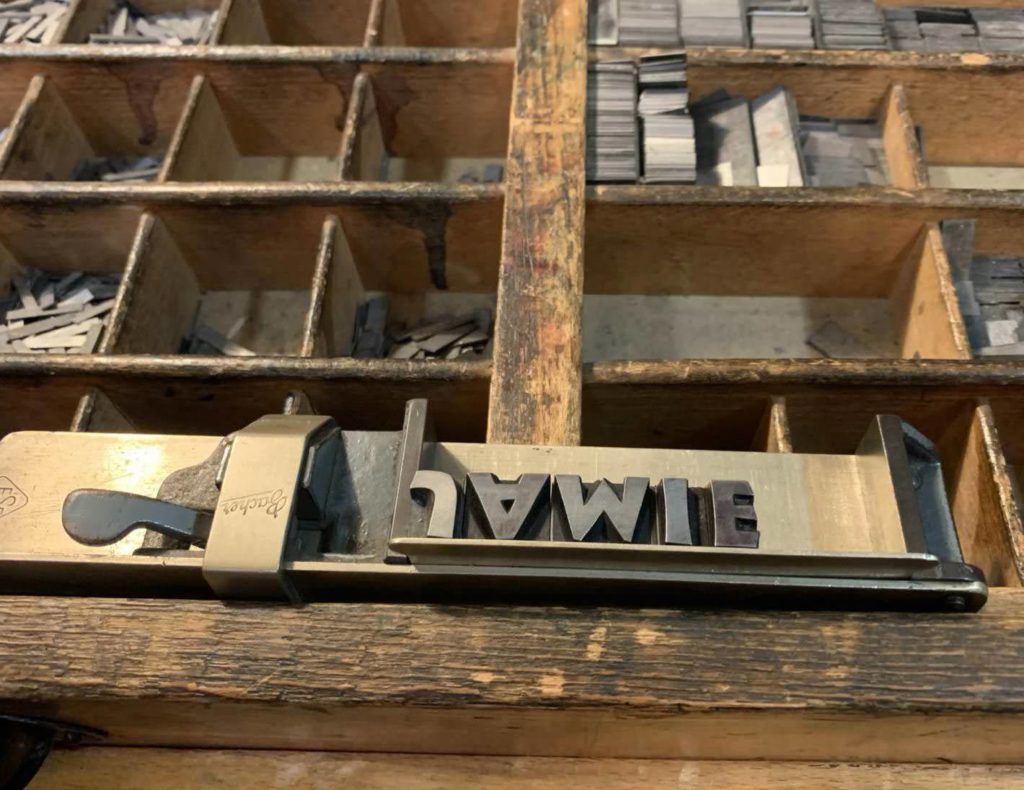
My next stop was the Klingspor Museum library to see some original Neuland type drawings or sketches. It turns out that there are no type drawings for Neuland because Koch punched them directly into metal without any preliminary sketches–just straight into the metal! The museum library did however have original type specimens which I was able to carefully look through.
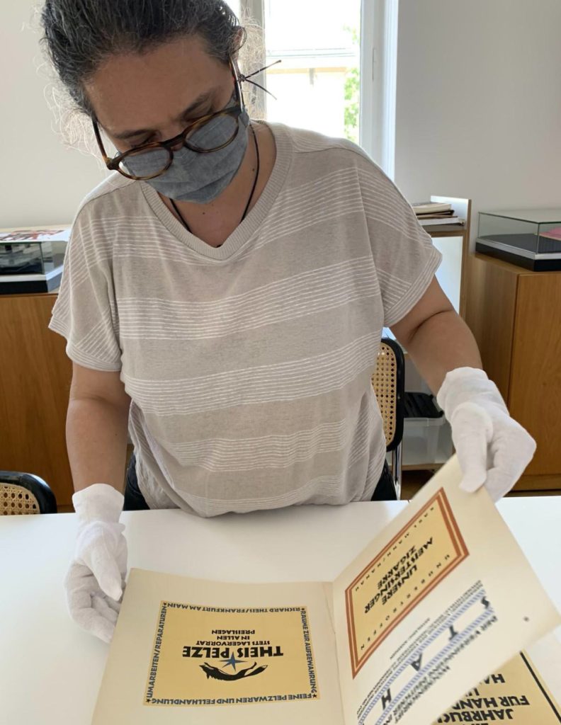
I spent some time asking questions and learning more about Koch and his work. The experts I talked to both at the Gutenberg Museum and at the Klingspor Museum had a vast amount of knowledge about Koch and the Neuland typeface, but none of them knew much about the history of the more modern writing style of Neuland Hand that was inspired by it.
However, I did learn a lot from this visit. It turns out that Rudolf Koch designed about 30 typefaces for the Klingspor Type Foundry. I also learned that his fonts were heavily used by the Nazi regime, due to the fact that he was an early Nazi sympathizer and supporter. This fact was difficult to swallow and had me really concerned about the project in general. The last thing that I wanted to do was design a typeface inspired by something that had such a dark and horrific past. It got me thinking about what my responsibility as a designer is, and the crucial role that typography plays in historical, cultural and political contexts. I decided to go home and do some more reading and research.
I bought a book called The Politics of Design by Ruben Pater (I highly recommend this book for designers to keep on hand for reference). The author highlights some critical points regarding the Neuland font specifically, which gave me even more pause. It turns out that in addition to the issues around the philosophical beliefs of its maker, the Neuland typeface has also been used in problematic ways since the golden age of advertising. When introduced in America in the 1950’s, Neuland came to be synonymous with the “exotic” or the “ethnic” and was often used — by white publishers — to represent products that were associated with Black culture. The book references this very in-depth article that talks about how “stereo typography” or “ethnic typography” – specifically referring to Neuland – can lead to racist designs, and that the use of these stereotypes can lead to serious and dangerous misrepresentations.
In general, I strive to use typography thoughtfully and responsibly. But now after learning all of this about Neuland, I was literally afraid to move forward, afraid of the possibility that I could create something that could contribute to these cultural misrepresentations. But now it was my turn to design a font and put it out into the world. So I asked myself, “What is my responsibility as a type designer to make sure that my work does not serve to support these types of destructive stereotypes?” Even after everything I learned, I don’t have an adequate answer to this question. What I do know is that the answer starts with awareness. This process taught me that it’s important to know the history of our sources. The Neuland typeface has a long history of being used in deeply problematic ways. And yet it’s also true that Neuland markers, and the Neuland Hand style of writing with those markers, is used in the service of collaboration, of listening, or learning, of human-centered innovation — of making the world a better place. Knowing the history of Neuland, which inspired the Neuland Hand style of writing with markers, and which has now inspired a new typeface, can help to ensure that we are careful with how we use it — and that we don’t misuse it.
Eeeek: shipping MarkerScribe
Having learned all this history, I went forward into actually starting to design the typeface. I went back to my markers, and drew and re-drew my letters to try to capture the fluid, yet strong presence that the Neuland Markers make on paper. Finally moving into the digital phase of the project and drawing my glyphs with vectors, I still had a long and arduous task ahead of me in what is referred to as “spacing,” which is one of the most challenging aspects of the type design process. One of the first things that you learn from more seasoned designers is that the white space within and in between the letters is just as important, or even more important than the letterforms themselves. This is just one of the many important nuggets that I picked up along the way. There is an overwhelming amount of rules and tips to remember. I have always respected type designers, but through this process, my respect has grown so much deeper.
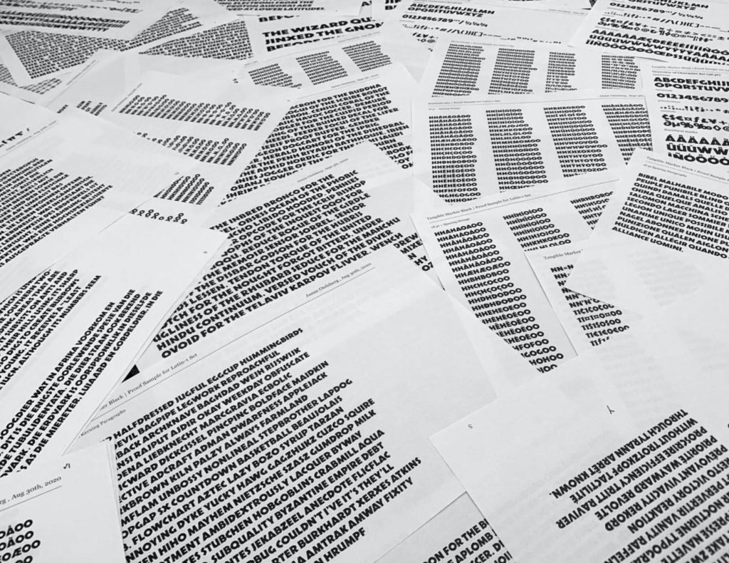
After many rounds of glyph drawing, spacing, re-drawing and then re-spacing, and printing out many proofs and comparing tiny details from one proof to another, I have finally finished a V1 of what we called “MarkerScribe.” I am not sure a digital font can ever do justice to the work that graphic recorders do with markers on paper, but this is my current best attempt, and I look forward to improving it based on their feedback.

I certainly learned a lot about designing type during this process, but I also learned about how to work with type and use type more responsibly. Regardless of the success of the typeface, the most important thing to me are the deep impressions that this process left on me. As said by Ralph Waldo Emerson, “It’s not the destination, it’s the journey.”
*Coincidentally, the company Neuland that makes Neuland Markers are in no way related to the Neuland font by Rudolf Koch or the Neuland Hand calligraphy style.
Special Thanks to:
James Young and Bruce Charonnat for the opportunity
Dan Marshall for the encouragement
Amanda Thacker-Heidtke and Sudha Darling for the support
Martina Flor for the excellent instruction and type crit (a defining moment for this project)
Jocelyn Bergen and Tommi Sharp for the expert feedback
Deb Aoki for the graphic recording inspiration
Alex Vybiral for driving me all around Germany
Gundela Kleinholdermann for the private tour at the Gutenberg Museum Workshop
The Klingspor Museum Library
References:
Heather Martinez (Neuland Ambassador)
https://www.letslettertogether.com/
Neuland Markers
https://eu.neuland.com/
The Politics of Design (Ruben Pater)
http://thepoliticsofdesign.com/
Rob Giampietro, New Black Face: Neuland and Lithos as Stereotypography
https://linedandunlined.com/archive/new-black-face/
Devroye, Luc. “Rudolf Koch.” Luc.Devroye.Org, 2020,
http://luc.devroye.org/fonts-24807.html
Heller, Steven. “The Man Who Made Kabel – Print Magazine”. Print Magazine, 2015,
https://www.printmag.com/daily-heller/the-man-who-made-kabel-rudolf-koch/
Type Design School (Lynne Yun)
https://typedesignschool.com/
Letter&Co Display Type Design Program (Martina Flor)
https://academy.martinaflor.com/p/letterandco
